Slider Template | High End 1
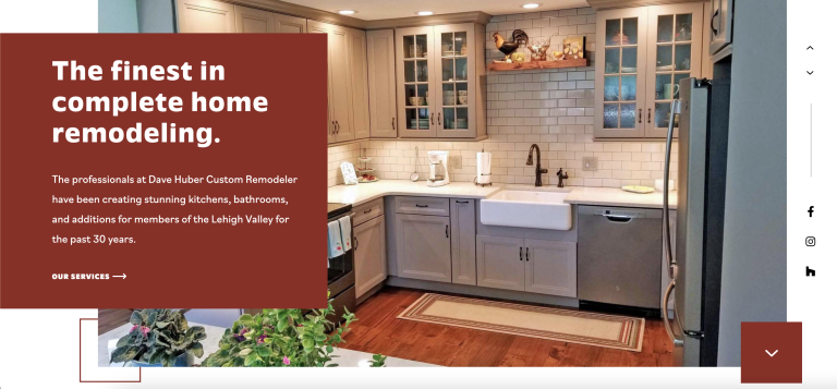
Template #003 This slider template is fully responsive and is set to align with 1200px max width layouts. It makes use of the "Slides" widget in Elementor, which makes it super easy to update images and content. Most style changes are done through the widget, but a couple are done through CSS. Download the JSON file with the CSS included, or download it without and copy and paste the CSS to the Customizer, if you prefer. Example In Use Posted By How To Install Lorem ipsum dolor sit amet, consectetur adipiscing elit. Ut elit tellus, luctus nec ullamcorper mattis, pulvinar dapibus leo. Download Files Full Zip File Download Download With CSS in Section CSS Full Zip File Download Download Without CSS JSON Files Lorem ipsum dolor sit amet, consectetur adipiscing elit. Ut elit tellus, luctus nec ullamcorper mattis, pulvinar dapibus leo. How To Install Lorem ipsum dolor sit amet, consectetur adipiscing elit. Ut elit tellus, luctus nec ullamcorper mattis, pulvinar dapibus leo. Copy & Paste CSS Add this CSS to Customizer > Custom CSS/JSThe beginning of this code is where to edit colors and styles. Everything below "LEAVE THIS CODE ALONE" is for positioning and functionality. /* YOU CAN EDIT THIS CODE */ /* Background Color for Content */ .swiper-slide-contents { background: var(--e-global-color-primary); } /* Content Learn More Button Style on Hover */ .homepage-slider .elementor-slide-button:hover { letter-spacing: 2px!important; } /* Content Learn More Button Arrow Color */ .homepage-slider .elementor-slide-button:before { background: #fff; } .homepage-slider .elementor-slide-button:after { color: #fff; } /* Slider Arrow Styles */ .homepage-slider .elementor-swiper-button { border-radius: 50%; } .homepage-slider .elementor-swiper-button:hover { background: var(--e-global-color-40a87286); color: var(--e-global-color-primary)!important; } /* Line Between Arrows and Social Media */ .social-buttons:before { background: #aaa; } /* LEAVE THIS CODE ALONE */ /* HOMEPAGE SLIDER */ .homepage-slider .swiper-slide { height: 600px!important; } .homepage-slider .swiper-slide-bg { margin-left: calc(50vw - 525px)!important; margin-right: calc(50vw - 600px)!important; min-width: auto; } /* ---SLIDE CONTENT--- */ .swiper-slide-contents { padding: 40px 40px 40px calc(50vw - 600px); width: calc(50vw - 150px); margin-top: -40px; } /* ----SLIDE BUTTON---- */ .homepage-slider .elementor-slide-button { padding: 0!important; } .homepage-slider .elementor-slide-button { position: relative; } .homepage-slider .elementor-slide-button:before { content: ''; height: 2px; width: 20px; display: block; position: absolute; right: 4px; top: calc(50% - 2px); transition: .7s ease; } .homepage-slider .elementor-slide-button:hover:before { width: 30px; } .homepage-slider .elementor-slide-button:after { content: 'f105'; font-family: 'Font Awesome 6 Pro'; transition: .7s ease; margin-left: 20px; } .homepage-slider .elementor-slide-button:hover:after { margin-left: 30px; } /* ---SLIDE ARROWS--- */ .homepage-slider .elementor-swiper-button { position: absolute!important; top: 80px; width: 30px; height: 30px; line-height: 30px; left: auto; right: calc(50vw - 653px); display: block; text-align: center; transition: .3s ease; } .homepage-slider .elementor-swiper-button-next { margin-top: 40px; } .homepage-slider .elementor-swiper-button-next .eicon-chevron-right:before, .homepage-slider .elementor-swiper-button-prev .eicon-chevron-left:before { content :'f106'; font-family: 'Font Awesome 6 Pro'; font-size: 16px; } .homepage-slider .elementor-swiper-button-next .eicon-chevron-right:before { content :'f107'; } /* ---SLIDE SOCIAL ICONS--- */ .social-buttons:before { content: ''; display: block; width: 1px; height: 120px; display: block; position: absolute; top: -160px; left: 50%; } /* RESPONSIVE */ @media only screen and (min-width: 1600px) { .homepage-slider .swiper-slide-bg { margin-left: 75px!important; margin-right: 75px!important;…